Introduction
As the Lead Product Designer at Bling, I owned the full redesign of our customer conversion funnel—guiding users from first interaction to paid subscription. Through dozens of in-depth user interviews and iterative design cycles, I uncovered friction points and shaped a smoother, more intuitive journey that ultimately boosted CLV by 10%.
Problem Statement
Most families still perceive Bling primarily as a pocket-money product. Parents and kids mainly use the allowance and card features, while awareness of the broader ecosystem—insurance, savings, tutoring, household tools—remains very low. As a result, Bling’s highest-value features are under-discovered and under-used.
Goal
Our challenge was to boost discoverability and awareness of the full family ecosystem while keeping the experience simple and appealing for all users.
MY ROLE
User Interviews
User Testing
Interface Design
TIMELINE
3 months
team
Product Design
Marketing
Development
Product Management
get the app
_SVG.svg)

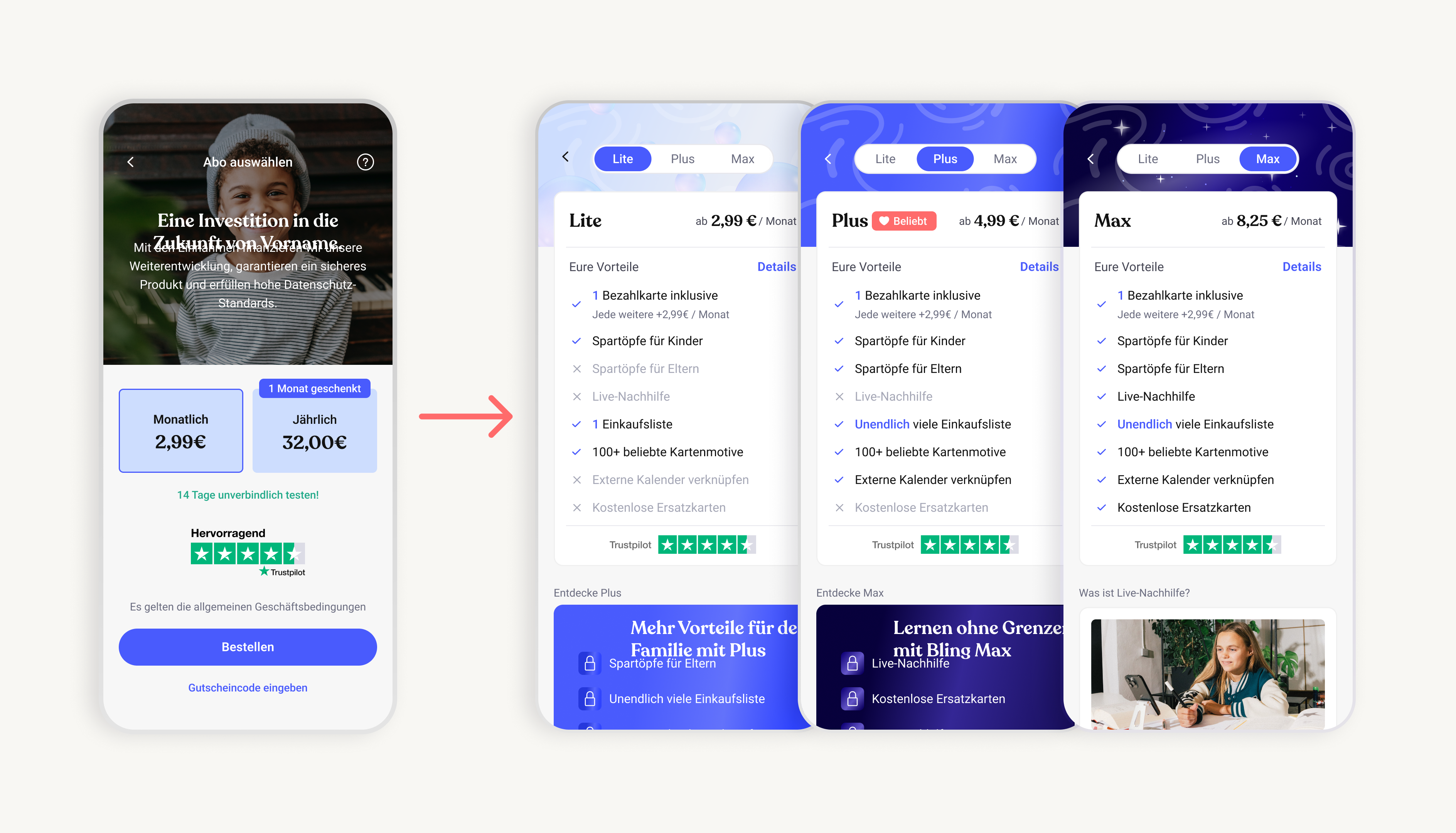
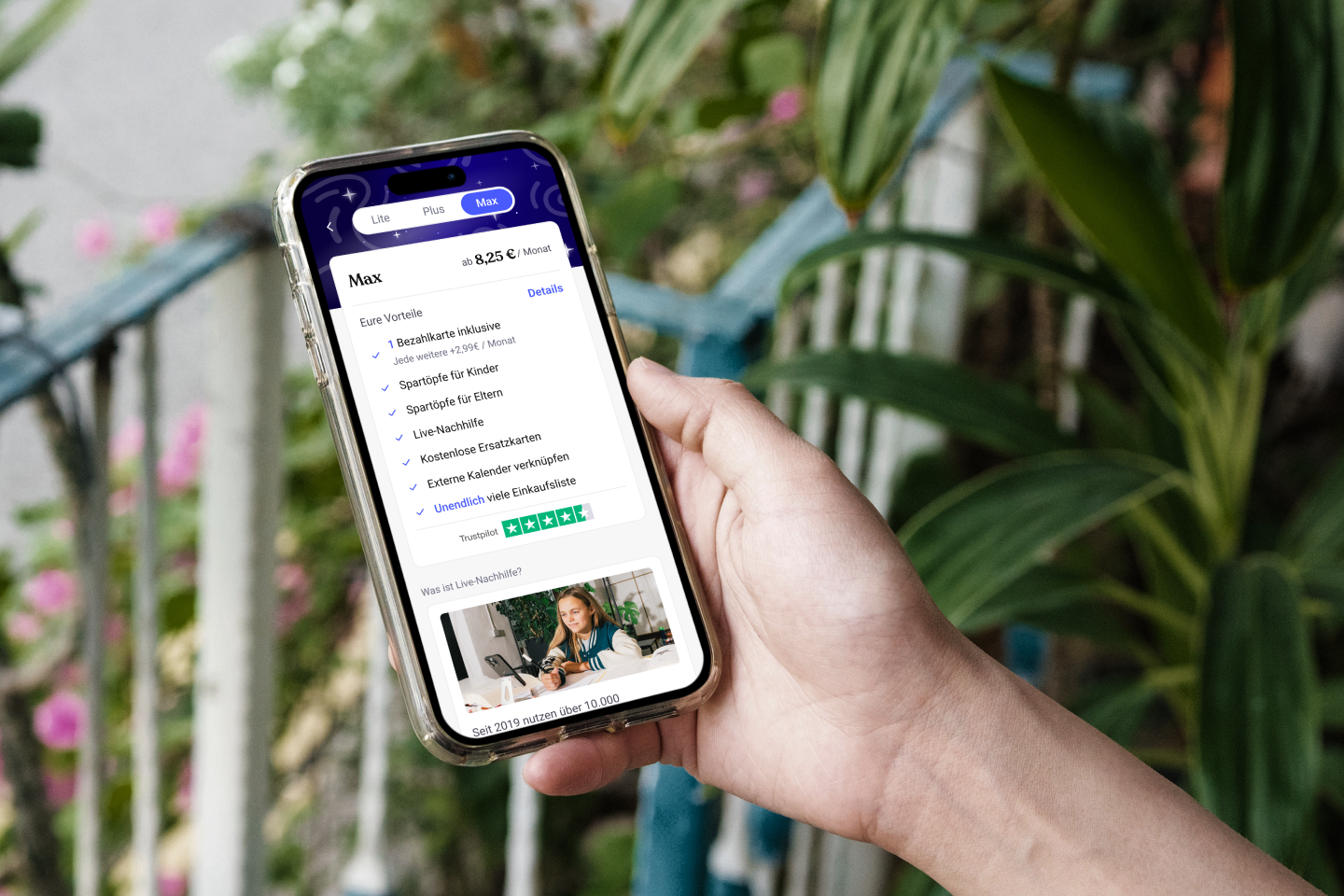
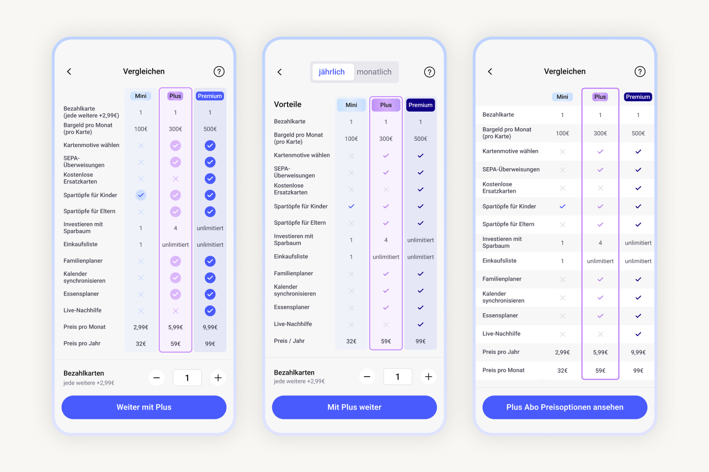
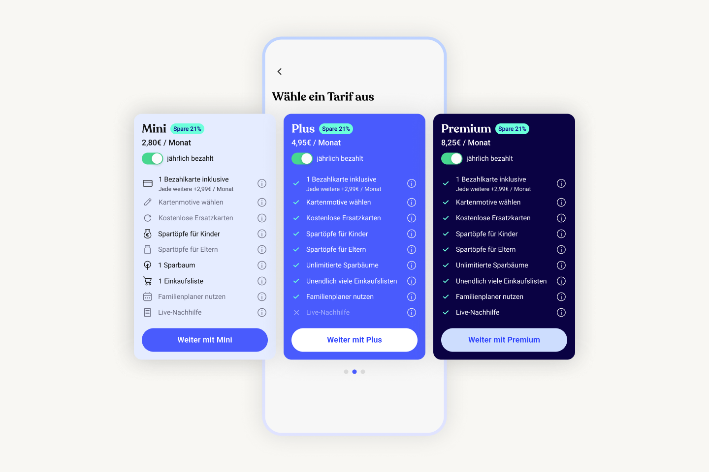
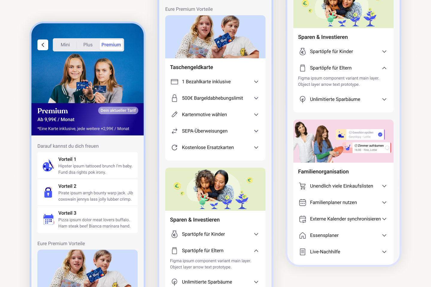
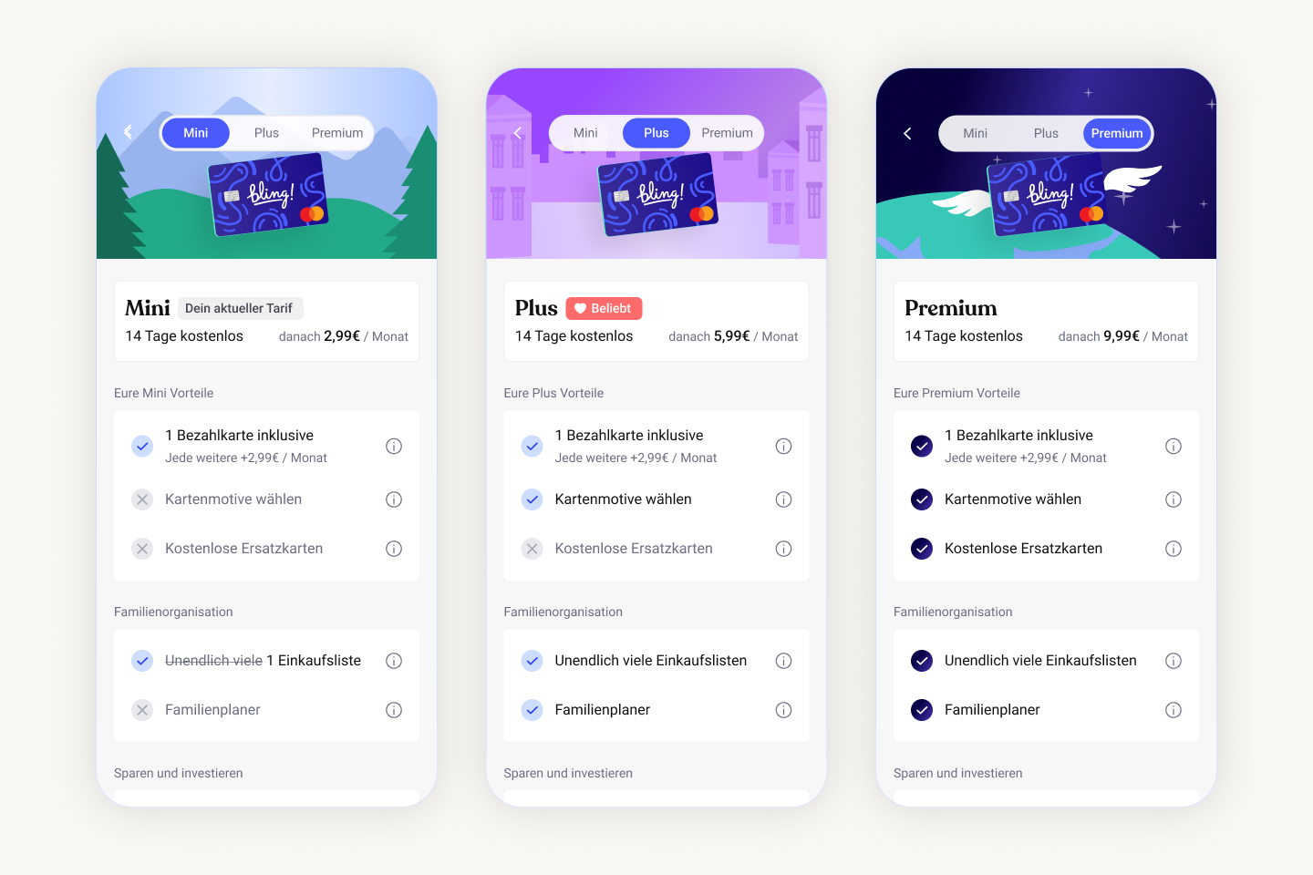
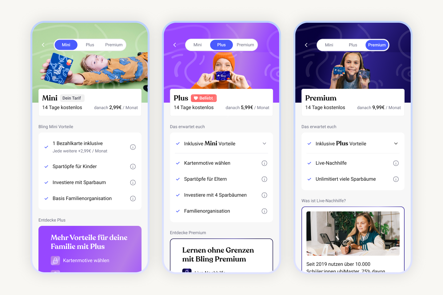
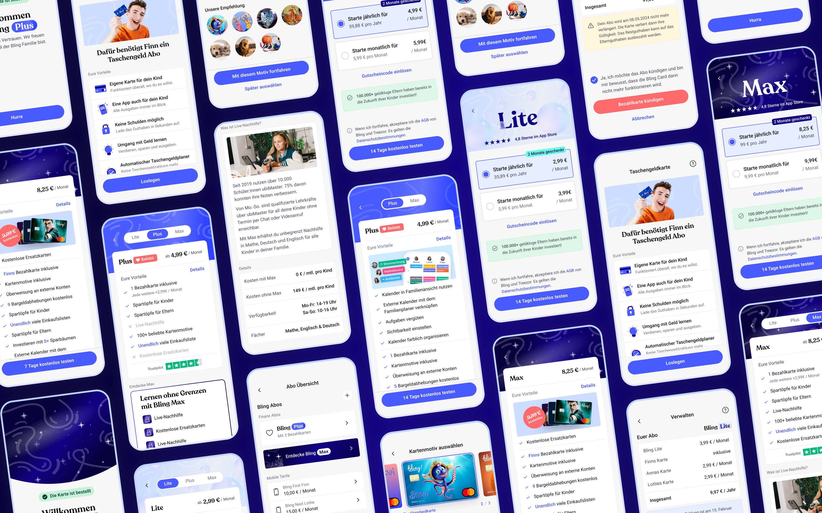
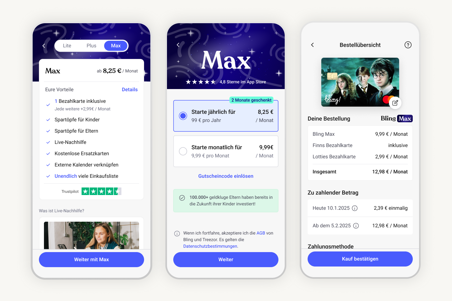
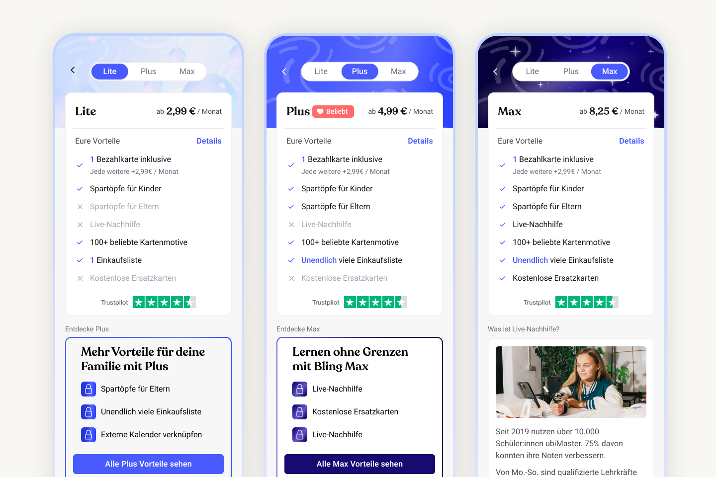
I redesigned the pricing into three clear tiers to help families match the right plan to their lifestyle, refreshed the card offering with playful designs for all ages, and brought our most overlooked yet highest-value feature to the forefront.
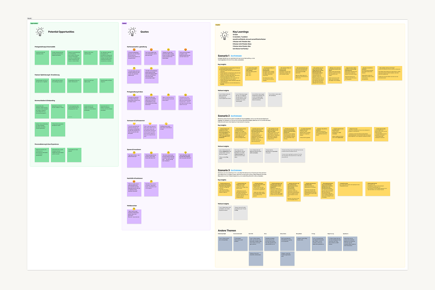
I began by conducting user interviews to understand what families valued most
🧠 Key learning: I learned that most families still saw Bling primarily as a pocket-money tool, leaving our broader high-value features largely undiscovered.
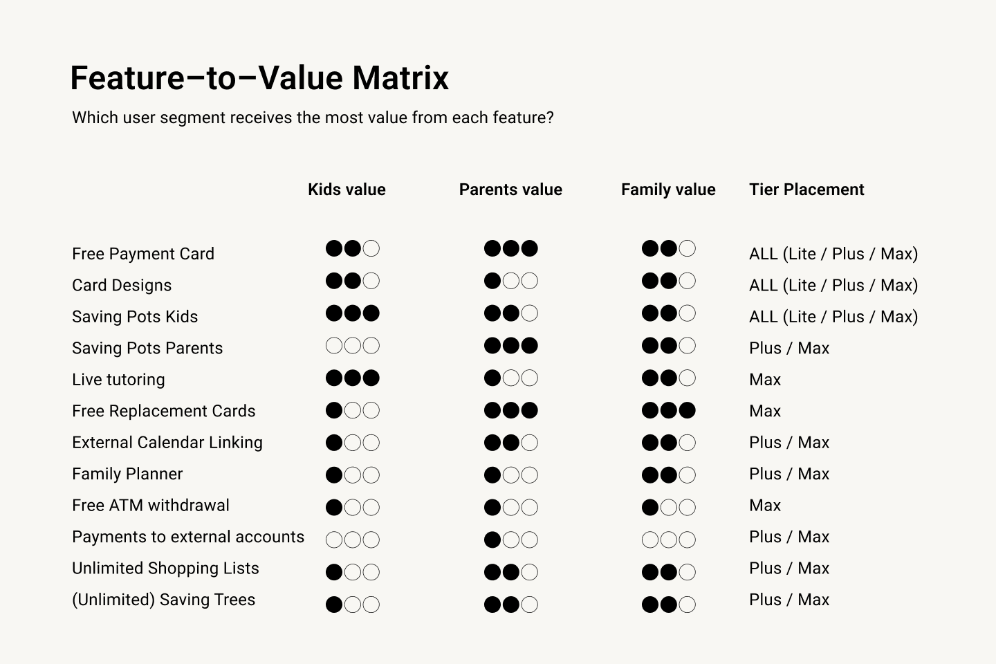
I audited all current and upcoming features and mapped them to the value they created for each segment.
🚀 Outcome: Using the value map, I identified what should differentiate a “basic,” “standard,” and “premium” plan. I focused on clarity while ensuring families immediately understood what they would gain at each level without feeling overwhelmed or upsold.
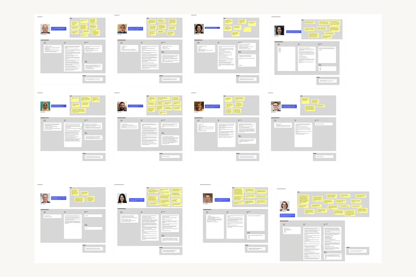
Through usability tests and rapid A/B validations, I evaluated how quickly users understood each tier
🚀 Outcome: I focused on testing which elements drove confidence, and where confusion persisted. I iterated based on misinterpretations, hesitation points, and feedback about perceived fairness.
I collaborated with product, finance, and marketing to validate that the tier structure aligned with revenue target
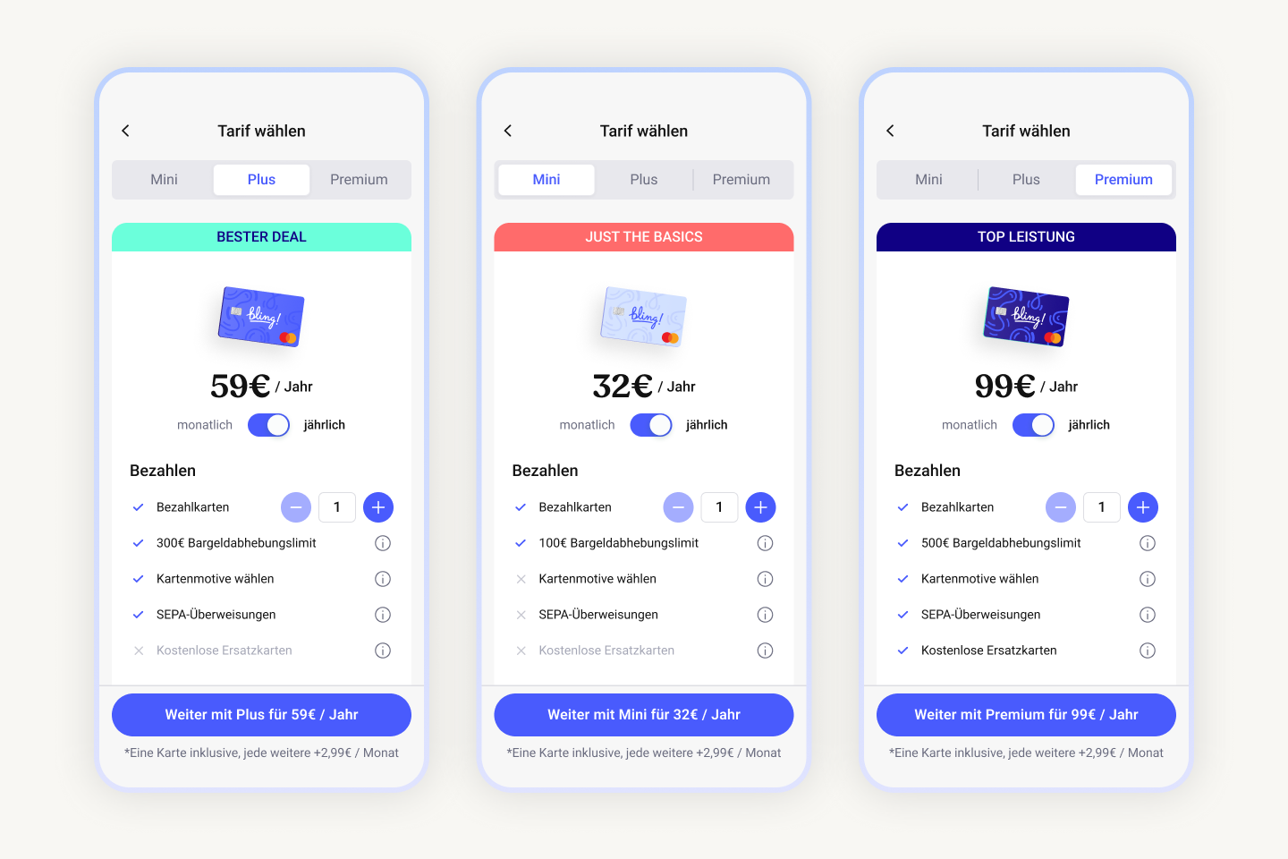
🚩 Challenge: We identified that the only technically feasible billing model for mid-cycle purchases was prorated charging. This created a UX challenge: explaining a non-intuitive pricing structure in a way that still felt fair and transparent to families.
🚀 Outcome: I designed a clear check-out page that broke down prorated costs and upcoming full-cycle charges in simple, predictable terms.
We made the card design flow a part of the experience
🧠 Key learning: When testing the pricing pages, we included the card designs in one variant and the response was so positive that we prioritized them for launch.
I refined the final design to make the tiers easy to compare while highlighting most desired features.
🚀 Outcome: I discovered through user research, that free tutoring was the strongest driver for upgrading to Max, yet most users weren’t aware of it. I elevated the feature on the pricing page and added locked previews in the lower tiers to boost visibility and discovery.
+13% CLV uplift
Through a complete redesign of the signup and pricing experience, I clarified the value of each plan, reduced friction across the conversion funnel, and helped families choose the tier that best fit their needs, resulting in a measurable 13% increase in customer lifetime value.
Feature discoverability increase
By highlighting Bling’s most valuable yet hidden features throughout onboarding, I made the broader family offering instantly visible, sparking a notable jump in feature engagement.